|
|
|
|
STAGE 1. PLANNING
Before we create the web page, it is important to have a previous plan in mind. This planning is nothing more than thinking and deciding a series of fundamental points ahead of time:
- What is this web page for? Who is going to visit my web page.
- What do I want to communicate? What topic will visitors find on the page.
- What structure or parts is this web page going to have? How to organize the content on my page.
- The 'Look" of the web page. the colours, the font type, the type of images, the way I place its contents, ...The best web pages out there maintain the same 'look' or visual identity in every page on the site.
1.What is this web page for? First, we need to think about our audience/viewers. We need to see the web site form the visitor's point of view; both an experienced user and a newcomer.
- Handling is an important matter. In other words, the web site needs to be easy to use. Other important Handling matters are:
- The web site needs to load in a short time. Thus, the web pages shouldn't be too heavy. They need to be short in size; including the images and other elements we use.
- Easy to read. The usual is for us to make our site easy to read. Therefore, we need to select a font type and a background colour which ease reading. We need to avoid using black backgrounds or shiny colours which make reading difficult (except if it's part of the 'look').
- We need to explain what can be found in the site from the beginning. In the Home or Main page, we need to place brief explanations about the contents of the site. We need to explain what can be found here and classify its contents in a clear way. It's important for us to explain its content; people can read; they shouldn't guess its contents.
- Clear information structure. We need to order the information into different sections and build an internal structure of simple navigation. It's is a good idea to place links on the Home or Main page as well as links to other pages in a specific page. For example, in the upper part of this page, we have a link to the "Home" or "Main Page" and to the "Contents" of this course.
- Meaningful links. We need to define each link clearly. We need to provide specific information on what we'll find if we click on that link. For example, it is better for a link to be named as "Course of Dreamweaver" than"Course 1". It's even better if it's called "Course of Web site Creation with Dreamweaver" in case the visitor is not familiar with this software.
- The web site needs to be accessible to the different web browsers or search engines. At least, we need to design the web site for it to be seen without problems in any common web browser. A common mistake is that of programmers who use an advanced browser and the web site can only be seen by a few people and not by 'common mortals'.
- What do I want to communicate? To be organized and productive, it is important for us to plan the contents we will use in our web site. We will need some text and images to build the site. We also need to consider that some images and text excerpts may be subject to copyright. However, there are some sites which have free images we can use.
- What structure or parts is this web page going to have? We need to decide:
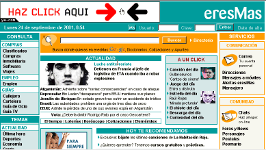
- The structure of pages. We need to decide how the content will be placed; how we are going to distribute it. Usually, web sites are structures in rows and columns. For example, the image below (in Spanish) shows a Header for advertisement, the title of the web site "eresMas", the date and a login for users. The body is structured into 3 columns (2 side columns and a wider one in the middle).
- The sections of the web site. We need to organize the pages in our site into different sections.
- The navigation schematic. In other words, we need to place links between the pages of the site and the link system, buttons and navigation bar. For example, EasyCoursesPortal uses links to the Previous Lesson and the Next Lesson, as well as links to other pages.
- The "Look" of the web page. When we are about to create a web site, it is a good idea for us to visit similar and successful site which present similar topics. If we pay close attention, we will find that the best web sites follow specific aesthetic patterns. The best sites use just a few colours and they combine them cleverly and in harmony. We need to decide on the colours we will use for our site. At the beginning, it is common for us to want to use several different colours and an inadequate combination. For example, in the image we saw above, 2 basic colours are used: light blue and orange. Then, we need to decide on the font type and the size of that font. For example, several sites use small font sizes and font types such as 'Verdana'.
|

