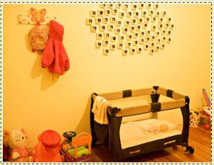
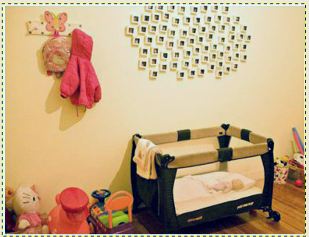
In the Previous Lesson, we explained a basic classification for the different light conditions. One of the most inconvenient forms of illumination or lighting is tungsten light, in other words, the type that usually illuminates homes.
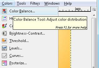
To be able to correct the predominant orange tone found in the photograph, we need to go to the Colour Menu and select Colour Balance
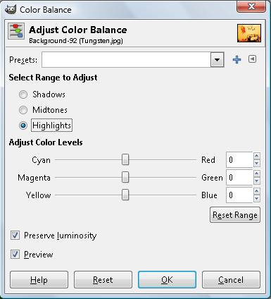
The main variables to correct are expressed in horizontal scroll bars which allow us to see the primary colours on one side and the complementary colours on the other.
In this particular case, since the predominant colour is orange, we need to use the buttons to counter it. These counter colours are found in both the Cyan spectrum and the Blue spectrum because a great deal of the orange component is formed by yellow and red.
We will disable the option 'Preserve luminosity' and work on the different zones of illumination in a scene. Thus, Gimp allows you to correct the colour according to illuminated areas; medium tones and shadows.
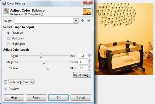
As you can clearly see when using the complementary colour, as we scroll the buttons to the opposite side of the dominant colour, the colours in the picture begin to gain balance.
Once we have been able to more or less correct that orange predominance, we select 'Ok'. .