Control Systems (II)
Flow charts:
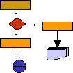
Flow charts illustrate a productive process flow to be able to compare reality and programming according to the quality handbook. We show the cadence of each productive stage in the process. It helps us evaluate a process during its design as well as after it. Since processes are frequently subject to changes, it is important to keep them updated.
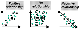
Dispersion diagram:
These diagrams describe in a graphical way if there is a relationship between two entities. Through a regression analysis, we can visualize if there is a causing relationship between a problem and an influencing factor. Having identified a relationship between both factors, we can carry out an effective correction of the cause.
Pareto diagrams (Pareto chart):
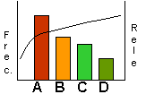
Frec.= frequency
Rele.= relevance
Quite often, we find a great quantity of problems or error causes which can't be corrected at the same time. In these cases, it is necessary to identify the most serious problems to establish a problem hierarchy and their solution according to their impact once they are solved. The Pareto analysis (based in Lorenz distribution type) visualizes the order of influencing factors of a problem. Frequently, we find out that a few problems are serious problems. This is a classical focus: 20% of the causes is the origin of 80% of the problems.

